Design
Bell Riose
January 09, 2025 · 8 min read
Designing QR codes that people actually scan
Bell Riose
January 09, 2025 · 8 min read
A scannable QR code comes down to four design fundamentals: enough contrast between the pattern and its background, a clear quiet zone around it, a large enough printed size for the distance people scan from, and adequate error correction. Get those right and you can add brand colors and a logo without the code ever failing in the wild.
A plain black-and-white square works every time, but it doesn't have to be the only option. With a little care, you can make a code that looks like yours and still scans on the first try. The trick is knowing which design choices are decorative and which ones the scanner actually depends on.
A camera doesn't see your code the way you do. It looks for high-contrast modules (the little squares), three finder patterns in the corners, and a clean border to lock onto. Every reliability rule below protects one of those things.
Here are the fundamentals, in plain terms:
If you only remember one thing: the camera needs contrast, a margin, and enough physical size. Everything else is styling on top.
Yes — and it's the single most common way to make a code feel on-brand. It works because the QR standard includes error correction: redundant data that lets a scanner reconstruct the code even when part of it is obscured, smudged, or covered. A centered logo simply sits inside that tolerance.
How much can you cover? As a general rule of thumb, at the highest error-correction level the QR standard can tolerate losing up to roughly 30% of its modules and still decode. That ceiling is a property of the QR specification, not a Pipao number — and you should never design right up to the edge of it. Treat it as headroom, not a target.
A good logo treatment is subtle: enough to signal the brand, small enough that the code never hesitates. If a scan stutters, the logo is usually the first thing to trim.
Big enough for the distance people scan from. The classic printing guideline is a 10:1 scan-distance-to-size ratio — for every 10 cm (about 4 in) of distance between the phone and the code, give the code roughly 1 cm (about 0.4 in) of width. A code scanned from across a room needs to be far larger than one on a table tent.
For close-range scanning, a widely used minimum is about 2 x 2 cm (0.8 x 0.8 in). Below that, dense codes with logos start to fail on lower-end cameras.
A quick way to estimate: take the farthest distance someone will reasonably scan from, divide by ten, and make the code at least that wide. Then round up — there's no downside to a code that's slightly too big, and plenty of downside to one that's too small.
Most failed codes break the same handful of rules. Here's the short version you can keep next to your design.
Use a dark pattern on a light background, keep a generous quiet zone, print large enough for the scan distance, add a small centered logo, leave the corner squares clear, and test on real phones before you print a single copy.
Inverting the code, low-contrast color pairs, gradients that fade the pattern, a logo that covers too much, text crowding the margin, glossy curved surfaces, and shipping to print without scanning a test first.
If you prefer a checklist you can scan top to bottom, here's the same advice mapped to whether each choice helps or hurts reliability:
| Design choice | ReliablePopular | Risky |
|---|---|---|
| Dark pattern on a light background | ||
| Inverted (light pattern, dark background) | ||
| Generous quiet zone around the code | ||
| Text or graphics crowding the margin | ||
| Small, centered logo | ||
| Large logo covering the corner squares | ||
| Printed at or above the size guideline | ||
| Shrunk to fit a tight layout | ||
| Matte, flat placement | ||
| Glossy or curved surface with glare | ||
| Tested on real phones before printing |
None of these are exotic. They're the difference between a code that works for anyone who lifts their phone and one that works for most people — and "most" is expensive when it's printed on a thousand flyers.
The right order matters: brand the code first, then prove it scans before anything goes to print. Skipping the test is how good-looking codes end up unreadable in the field.
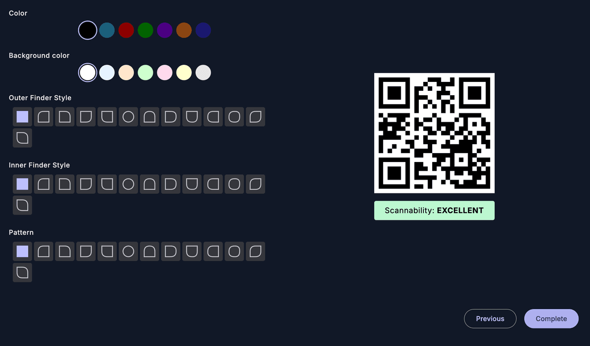
Use your brand color for the pattern on a light background and add a small, centered logo. Keep contrast high and the corner squares clear. In Pipao you save your brand colors and logo once, so every new code starts on-brand.
Size the code for the distance people will scan from using the 10:1 guideline, and choose an error-correction level that comfortably covers your logo without making the pattern too dense to print small.
Print or display the code at the actual size and distance people will use, then scan it on several phones — old and new, iOS and Android. If any device hesitates, increase contrast or size, or shrink the logo, and test again.
Once it scans reliably across devices, send it to print with confidence — and because Pipao codes are dynamic, you can still change where it points later without redesigning a thing.
There's a quiet advantage to designing with a dynamic code: the destination isn't baked into the pattern, so a beautifully branded code you printed once can point somewhere completely new tomorrow — no reprint, no redesign. With a static code, the link is locked into the printed image; change anything and you start over.
That means your design effort compounds instead of expiring. A café's branded table code can swap menus seasonally. An event creator's flyer code can update after the venue changes. The look you tested and shipped keeps working, even as the content behind it moves.
It also means you can measure whether your design is doing its job. Pipao tracks real scan signals — count, location, device, and timing — so you can see how often a code is actually scanned and on which devices. If a beautifully branded code underperforms a plain one, the data tells you, and you can adjust. See QR code analytics: understanding your scan data for how to read those signals.
For the difference between the two code types and when each makes sense, read static vs dynamic QR codes: which one do you need?
Most QR tools stop at the image and leave you to find a designer, a print shop, and a courier. Pipao closes that loop — you design the code, choose a print template, buy it, and we print and ship the finished code to your door. Because it's dynamic, you can still edit where it points after it arrives.
That changes how you should design from the start: build it on-brand, test it once, and order the physical product knowing you'll never have to reprint just because a link changed.
For the full walkthrough of the physical loop, see dynamic QR codes, printed and shipped to your door.
Save your brand colors and logo once, design your QR code, test it, then have it printed and shipped to your door — and edit it anytime without reprinting.
No credit card required
Good QR design is invisible: people just scan, it just works, and your brand comes along for the ride.
Four things: strong contrast between the pattern and its background, a clear quiet zone (empty margin) around the code, a large enough printed size for the scan distance, and adequate error correction. Get those right and almost any phone camera reads the code on the first try, even if you've added brand colors and a logo.
Yes. The QR standard has built-in error correction, which lets a code stay readable even when part of the pattern is obscured. A modest, centered logo sits inside that tolerance. As a general rule of thumb the code can survive losing up to roughly 30% of its modules at the highest error-correction level — so keep the logo small and centered, leave the three corner squares clear, and always test before printing.
A common industry rule of thumb is a minimum of about 2 x 2 cm (0.8 x 0.8 in) for close-range scanning, and a 10:1 scan-distance-to-size guideline for anything read from afar — roughly 1 cm of code for every 10 cm of distance. These are general printing guidelines, not exact figures. Always scan a test print at the real size and distance before committing to a run.
Almost any color, as long as the pattern stays clearly darker than its background. Dark-pattern-on-light-background is the safe default. Avoid low-contrast pairings, gradients that fade the pattern, and inverted codes (light pattern on dark), which many scanners read less reliably. When in doubt, test it on several phones.
The usual culprits are too little contrast, a missing or shrunk quiet zone, the code printed too small for the scan distance, a logo covering too much of the pattern, or glare and curvature on the physical surface. Increase contrast and size, restore the margin, shrink the logo, and re-test. If the destination ever changes, a dynamic code lets you fix it without reprinting.
Not with a dynamic code. A dynamic QR code's pattern points to a destination you control, so you can change where it sends people anytime without touching the printed design. Pipao codes are dynamic, so a branded code you printed last month can point somewhere new today — no reprint.